
Marketing & Sales Strategies
Marketing & Sales Strategies
10 A/B Testing Ideas for eCommerce Sites
10 A/B Testing Ideas for eCommerce Sites
10 A/B Testing Ideas for eCommerce Sites
Oct 28, 2024
|
5
min read
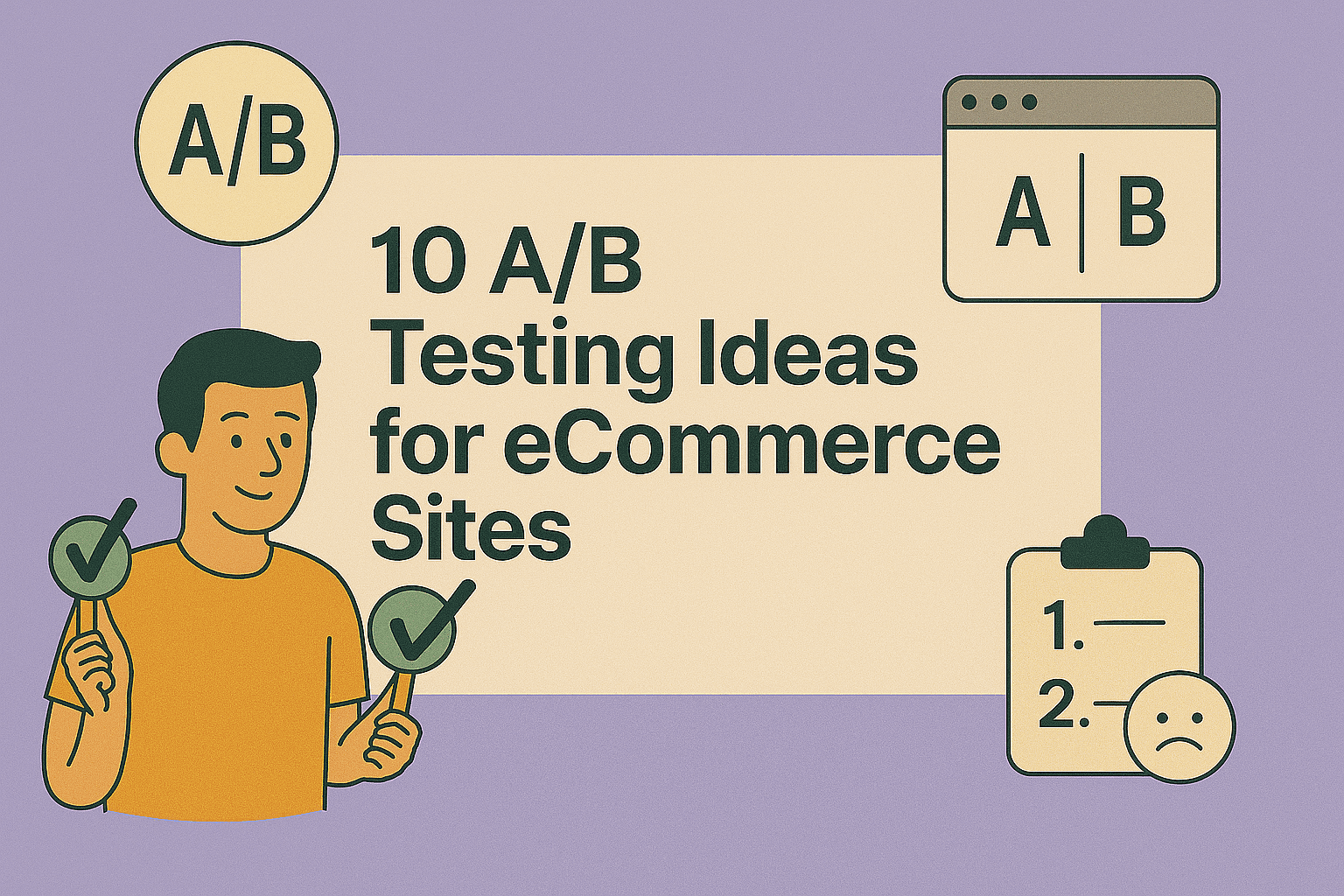
Running a successful eCommerce business isn't just about setting up a storefront—it's about continuously optimizing every element of your site to improve conversions, sales, and user experience. A/B testing (also known as split testing) is one of the most powerful ways to do this. Below are 10 practical A/B testing ideas to help you grow your online store, backed by proven strategies and conversion science.
10 A/B Testing Ideas for eCommerce Sites
1. Test Product Page Layouts
Your product page is one of the most critical parts of your sales funnel.
What to test:
Image placement (left vs. right)
Description tabs vs. long scrollable content
Social proof positioning (e.g., reviews at the top vs. bottom)
Why it matters: Layout impacts eye movement and decision-making. A simple shift can significantly increase time-on-page and add-to-cart rate.
2. Optimize Call-to-Action (CTA) Buttons
CTAs drive your conversions. If they’re unclear or boring, users won’t act.
What to test:
Text variations (e.g., “Buy Now” vs. “Add to Cart”)
Button colors (e.g., red vs. green)
Placement above vs. below the fold
Tool: Unbounce for fast CTA A/B testing on landing pages.
3. Test Product Titles and Descriptions
Copywriting has a big influence on buying behavior.
What to test:
Short vs. detailed product titles
Feature-driven vs. benefit-driven descriptions
Storytelling-based descriptions vs. technical specs
Copyhackers – Writing for Conversions
4. Vary Product Image Formats
Visuals sell, especially in online retail.
What to test:
Static images vs. 360-degree views
Video demo vs. product carousel
Lifestyle images vs. white background product photos
Tool: VWO for visual and multimedia A/B testing.
5. Experiment with Pricing Display
How you present pricing influences perceived value.
What to test:
Showing prices with discounts (“$50, now $39.99”)
Including taxes or shipping fees upfront
Anchoring with a higher original price
Tip: Highlight scarcity (“Only 3 left!”) and urgency (“Sale ends tonight!”) for even more impact.
6. Refine Checkout Page Elements
Your checkout page is where visitors turn into customers.
What to test:
Guest checkout vs. required login
Progress bar vs. no progress bar
Coupon code visibility (e.g., hidden behind a click vs. always shown)
Baymard Institute Checkout Guidelines
7. Personalize Product Recommendations
Smart recommendations can increase AOV and customer satisfaction.
What to test:
“Recommended for you” vs. “Customers also bought”
Dynamic recommendations based on browsing history
Number of suggested products (e.g., 3 vs. 5)
Tool: Algolia Recommend
8. Play with Trust Elements
Building trust means more conversions and fewer abandoned carts.
What to test:
Placement of trust badges (top, near CTA, or in footer)
Number of reviews displayed
Inclusion of “100% Money-Back Guarantee”
Trustpilot – The Power of Reviews
9. Offer Different Promotions
The type and timing of a promotion can drastically affect performance.
What to test:
Discount percentage vs. dollar amount ($20 off vs. 20% off)
Free shipping vs. free gift
Flash sale countdown timers vs. evergreen offers
Tool: Optimizely — Great for advanced campaign A/B tests.
10. Test Homepage Elements
The homepage sets the tone for the entire customer journey.
What to test:
Banner vs. video hero section
Value propositions above vs. below the fold
Personalized greeting (“Welcome back, John”) vs. generic greeting
11. Test Product Pages
The product pages are where customers make their purchasing decisions. Optimizing these pages is critical to boosting conversions.
What to test:
Product description length
Test short product descriptions focusing on key details against longer, more informative versions. Learn more on how to write high-converting product descriptions.
Image formats
Use high-resolution static images or experiment with rotating 360-degree views. Check out best practices for product photography.
Call-to-action (CTA) placement
Experiment with the position of the 'Add to Cart' button—near the top vs. beneath detailed descriptions. See this guide for effective CTA placement.
Customer reviews section
Place customer reviews above or below the fold. Additionally, test different review layouts, such as star ratings versus full testimonials. Why reviews impact purchase decisions.
Scarcity tactics
Display “limited stock” notifications versus showing no stock-related information. Discover how urgency improves sales.
12. Test the Checkout Process
A smooth and hassle-free checkout can significantly reduce cart abandonment rates and improve user satisfaction.
What to test:
Guest checkout vs. mandatory account creation
Assess whether allowing guest checkouts boosts order completion rates. Learn more about avoiding cart abandonment.
One-step vs. multi-step checkout
Determine which format leads to fewer drop-offs during checkout. See top tips for optimizing your checkout design.
Payment options
Test offering only traditional methods (credit/debit cards) against including modern options like PayPal, Apple Pay, or BNPL (Buy Now, Pay Later). Explore integrating flexible payment solutions.
Coupon code visibility
Experiment with placing the “Enter Coupon Code” field visibly versus hiding it behind a clickable link. Understand the psychology behind discounts.
13. Test Navigation Menus
Good navigation helps users find what they need effortlessly, increasing engagement and time on site.
What to test:
Mega menu vs. standard dropdown
Compare user interactions with a traditional dropdown versus an expansive mega menu that lists all categories. See how to build user-friendly navigation menus.
Sticky headers
Make the header navigation sticky and test it against a non-sticky version. This ensures users always have easy access to the menu bar. Find out the benefits of sticky navigation.
Category organization
Rearrange categories to fit customer intent, for instance, changing from product-based (e.g., shirts, shoes) to scenario-based (e.g., party, workwear). Learn more about website taxonomy.
14. Test Search Functionality
A robust and efficient search feature helps users locate products quickly, reducing frustration and positively influencing sales.
What to test:
Search bar size and placement
A prominently positioned, large search bar versus a smaller one inside the header. Design principles for search functionality.
Search result filtering
Offer robust filter options, such as price range and popularity, compared to basic filtering. Optimize search filters.
Predictive search
Include auto-suggest or predictive text that previews products as users type. Boost conversion with predictive search.
Personalized search results
Use AI to tailor search results based on user history compared to generic results. Implementing AI in eCommerce search.
15. Test Mobile Optimization
With the majority of users browsing through mobile devices, ensuring a seamless mobile experience is non-negotiable.
What to test:
Page layouts
Test single-column, mobile-friendly layouts versus desktop-style layouts. Improve mobile performance design.
Navigation on mobile
Use expandable hamburger menus compared to visible navigation bars. Best practices on mobile navigation.
Button sizes and clickability
Ensure buttons are touch-friendly by testing various sizes and padding. Usability standards for mobile buttons.
Loading speed
Test your mobile website’s performance and experiment with lightweight versions to enhance speed. How loading speed impacts bounce rate.
By thoroughly testing these elements using tools like Google Optimize, Hotjar Heatmaps, and SplitMetrics, you can continually improve your eCommerce experience.
Start small, test frequently, and iterate based on data-driven insights to maximize your results.
Final Thoughts
The best-performing eCommerce brands are constantly testing, learning, and iterating. A/B testing isn’t a one-time event—it’s a continuous process of improvement. By implementing the 10 ideas above, you can uncover hidden opportunities, reduce bounce rates, increase average order value (AOV), and build a shopping experience your customers love.
Bonus Tip: Always run one test at a time per page element to avoid mixed signals.
Next Step: Use Google Optimize or Convert.com to begin your first A/B test today.
Share It On:
Related Articles
Related Articles
Related Articles

Save time, close more deals
Streamline your eCommerce operations and take control of your order management with Qallix

Save time, close more deals
Streamline your eCommerce operations and take control of your order management with Qallix
Save time, close more deals
Streamline your eCommerce operations and take control of your order management with Qallix